• Austin SEO
    • About TastyPlacement
    • TastyPlacement in the Press
    • Meet the Team
  • Blog
  • Services
    • SEO Services
      • WordPress SEO Service
      • Magento SEO Services
      • Conversion Rate Optimization
      • SEO Audit Service
      • Why Google Certification Matters
      • ChatGPT SEO & AI SEO Service
    • PPC & Google Ads
      • Google Ads & PPC Management
      • Remarketing Services
      • Display Ad Management
      • Facebook Ad Management
      • Google Ad Grants Management for Non-Profits
      • Adwords App Install Ad Management
      • Product Listing Ad Management
    • Analytics & Data
      • Analytics and Monitoring
      • Google Tag Manager Experts
      • Data Studio Development & Consulting
    • Social Media & Local Marketing
      • Social Media Marketing
      • Local SEO
    • Web Development
      • Mobile Website Design
      • WordPress Development
  • Case Studies
    • SEO Case Studies
      • SEO Case Study: We Beat Lowes, Then We Beat Home Depot
      • SEO Case Study: Total Domination in Houston for Medical Provider
    • Analytics Case Studies
      • Case Study: Updated Design Yields 43% Increase in Conversion Rate
      • Case Study: PPC Optimization Yields Tripled Conversion Rate
    • Social Media Case Studies
      • Social Media Case Study: Hundreds of New Customers From Core Facebook Campaign
  • Portfolios
    • Display Ad Portfolio
    • Design Portfolio
    • Infographic Portfolio
    • SEO Testimonials
  • Contact
    • New Customers: Get to Know Us
    • Customer Service & Support
    • Referral Program
    • SEO Training Seminars
    • Job: Paid Search/PPC/Adwords Analyst
    • Job: Local Digital Marketing Specialist
    • Job: SEO/Marketing Junior Analyst
    • Privacy Policy & Terms of Use
  • Click to open the search input field Click to open the search input field Search
  • Menu Menu

These articles and tutorials are handy guides.

Monitor Size Statistics for Web Design & HTML

Web Design

Updated for 2012

Have you ever wondered how many 800 x 600 website viewers are still roaming the internet? More than you might think. More importantly, have you ever wondered about the monitor sizes of the viewers of your own site? The capability to discern your own user statistics (monitor sizes, and a lot more) is well within your grasp–in fact, you may already be missing it.

Browser/Monitor Sizes on the Internet Generally

It’s helpful to know the monitor dimensions of internet users generally; this lets you plan your designs to deliver a good experience to website visitors. W3Schools keeps a running tally of monitor sizes that visit its website but the statistics do not appear to account for mobile websites, so just remember that you need to account for mobile website visitors separately.

For 2012 (January through November) we see the following statistics on about 73,000 visitors:

Monitor Size Statistics

A few details are worthy of mention. First, recent years have seen a proliferation of browser/monitor sizes. We see a nearly endless “long-tail” of single instances of very unusual browser sizes like 1795×1011 and 1540×963, just to name a few. These odd sizes make statistical analysis a little foggy. Generally though your top 10 or 15 monitor sizes are going to give you a fair sense of who’s visiting.

Now, just for reference, the statistics above are a far cry from what we reported in 2008:

Screen Resolution Visits
1.

1024×768

383 37.73%
2.

1280×800

147 14.48%
3.

1280×1024

114 11.23%
4.

1440×900

82 8.08%
5.

1680×1050

59 5.81%
6.

1280×768

50 4.93%
7.

1920×1200

42 4.14%
8.

800×600

38 3.74%
9.

1152×864

35 3.45%
10.

1280×720

11 1.08%

Browser/Monitor Sizes of YOUR Website Visitors

Since we first wrote this post in 2008, Google Analytics has gone through a few redesigns–GA still offers the capability of showing your website visitors’ browser size, it’s just a little harder to find.

Instructions:

[icon_list style=”check”]

  • Sign in to Google Analytics and click the “Standard Reporting” button on the top bar.
  • On the left navigation, click “Audience” to expand sub-menu and then click “Technology” to expand sub-menu
  • Click “Browser & OS”; the main window will now display a table showing browser statistics
  • Click on “Secondary Dimension” at the top of the table as shown in the screenshot and scroll down to select “Screen Resolution”
  • The table will then display your visitors’ monitor sizes.

[/icon_list]

Analytics

Handy, huh? And don’t be surprised if you see a few 800 x 600 viewers still kicking around.

November 14, 2012/by Michael David
https://tastyplacement.com/wp-content/uploads/web-design2.jpg 234 581 Michael David https://tastyplacement.com/wp-content/uploads/tastyplacementneedssvg.svg Michael David2012-11-14 03:00:052012-11-14 14:43:28Monitor Size Statistics for Web Design & HTML

Web Tour: Early Websites of Internet Giants

Web Design

I like to play around with Way Back Machine – the site that archives screen shots of websites in years past.  We’ve put together a little tour of early versions of now-ubiquitous websites. We think you’ll enjoy this little web tour. So, put on some Pearl Jam (they were hot in 1998) and set your browsers to 640 by 480 and relax:

Google in 1998:

google

This incarnation of Google was still hosted at Stanford University and featured an index of 25 million pages, but was “soon to be much bigger”.

Yahoo.com in 1996:

yahoo

Apple.com in 1997:

apple

We love this early Apple design, only about 400 pixels wide. This site would fit on most cell-phone browsers.

Tiger Direct in 1996:

Untitled-4

An early version of online retail giant Tiger Direct.

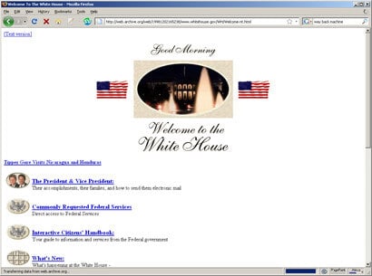
WhiteHouse.gov in 1998:

Untitled-5

A fine-looking site from 1998, from President Clinton and the man who invented the internet.

Infoseek in 1997:

Untitled-6

A pre-Google version of Infoseek…

Compaq.com in 1996:

Untitled-7

NBC.com in 1996:

Untitled-8

June 26, 2009/by Michael David
https://tastyplacement.com/wp-content/uploads/web-design2.jpg 234 581 Michael David https://tastyplacement.com/wp-content/uploads/tastyplacementneedssvg.svg Michael David2009-06-26 13:25:412012-04-24 20:31:39Web Tour: Early Websites of Internet Giants

Tutorials & Case Studies

  • Analytics
  • Case Studies
  • Infographics
  • Local Maps and Local Listings
  • Magento
  • Mobile SEO
  • Our Book: SEO for Wordpress
  • PPC
  • Programming & PHP
  • SEO
  • SEO Power Tools
  • SEO Resources
  • Social Media Marketing
  • Web Design
  • WordPress

Our Most Recent Tutorials & Case Studies

  • Tired of Expensive Website Uptime Monitoring Services? Build Your Own Uptime Monitor, 100% Free
  • Determining how and when Google Analytics 4 collects website event data
  • Infographic: Fonts & Colors That Drive the World’s Top Brands
  • Research Shows a 23% Divergence Between UA and GA4
  • How to Track Google Analytics Conversions on BuilderTrend’s iFrame Form

Search

Search Search

Archives & Tutorial Categories

  • Analytics
  • Case Studies
  • Infographics
  • Local Maps and Local Listings
  • Magento
  • Mobile SEO
  • Our Book: SEO for Wordpress
  • PPC
  • Programming & PHP
  • SEO
  • SEO Power Tools
  • SEO Resources
  • Social Media Marketing
  • Web Design
  • WordPress

Austin SEO Company, TastyPlacement

Click Here to Explore a Free Consultation

Our Most Popular Services

  • Austin SEO [Home]
  • WordPress SEO Service
  • PPC Management
  • Social Media Marketing
  • Analytics and Monitoring
  • Remarketing Experts
  • Conversion Rate Optimization

Let’s Talk: How to Get in Touch With Us

TastyPlacement Inc.
1214 W. 6th St. Ste 201
Austin, TX 78703
Tel: (512) 535-2492


Get Directions or Read Our Awesome Reviews on Google Maps
© Copyright - Austin SEO Company | TastyPlacement
  • Link to Facebook Link to Facebook Link to Facebook
  • Link to Instagram
  • Link to LinkedIn Link to LinkedIn Link to LinkedIn
  • Link to Pinterest
Scroll to top Scroll to top Scroll to top