Case Study: Updated Design Yields 43% Increase in Conversion Rate
With Just Text, Images, Layout, We Transformed an Average Performing Page into a Top-Performing Landing Page
Let’s dive right in. We have a client in the moving business here in Austin. Since we’ll show you their screenshots, it should be quite easy to tell that our client is Unicorn Moving. Our client had a decent performing landing page; it generated plenty of customer action but our instincts told us we could do better.
From here, we’ll skip forward just to show the chart with a 43% Conversion Rate increase:

Here is an overview of what the two pages look like, with the prior page on the left and the new design on the right. Some of you more experienced readers might see some issues emerging already with the older design.

The Starting Design for Our Conversion Rate Challenge:
As we said, this was a competent performing landing page, but we wanted to dig deeper to strive for vast increases in conversion rates through the practice of Conversion Rate Optimization. Our site was a fully responsive mobile design and we drove traffic to the site through SEO in the Austin area (with a focus on Local SEO) as well as by managing a Google Ads campaign.
This client has a very notable characteristic: they actually don’t suck at moving so they’ve gotten “Best of Austin” in our local newspaper annual round-up many many times. That’s a great accolade–but it’s not presented well on the old design. The old design was built up over time, with contributions from various parties over the course of years. Our approach was to take a fresh look and consider everything as a whole. Here are the issues we identified with the old design:
- While the “Best of Austin” award is great, it’s repeated too many times: with 2 repeated Gold Logos, one more “2018 Best” with some text above it, and text along the top banner. That’s quite a lot of repetition, but no single one of the repeats is very effective.
- There is a lot of dark background going on. “Light and Bright” always sold well, and still does.
- The text on the slider/hero bar, it’s barely legible over the image behind it. The phone number, in text, is simply not an effective idea.
- The headings in Green Text in the 3 columns, there really isn’t a reason they shouldn’t be the color of the surrounding text.
- Where’s the text? There are 3 columns of text with bland headings, there is no advocacy for the brand or product in the headings or in the body text.
Before we move forward, lets set forth that the client (like nearly any mover) would prefer a complete quote request, but that a phone call from a potential client is acceptable.
Moving Forward With the Conversion Rate Challenge
Ok, so we started to work through the issues we saw with the landing page design and put together some new ideas.
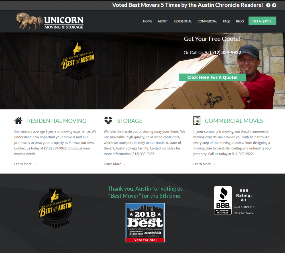
The 1st challenge was how to present our strongest point: the consistent “Best of Austin” award. We wanted it to be more prominent, but repeating it wasn’t working so we made one much stronger presentation of this element, which you can see below. We chose a single badge that happened to have “2018” in the text which shows that we are still on top and not simply reporting 5-year old news. We chose one headline and put it front and center, “Voted ‘Best of Austin’ Movers 6 of the Last 8 Years”.

But we did more with this element: we chose an image that worked with our design, so there were no graphic elements behind our headline, this would have distracted from this important message.
We also put a transparent overlay over the hero image to darken it and draw visitor attention to our refreshed messaging. Note how much easier it is to read the text on the new hero section. The hero image itself is generic–but that’s ok, we aren’t trying to draw attention to it, quite the opposite.
Our new hero section has a flow to it now….from top to bottom there is the messaging headline, then a badge, followed by 2 calls to action. This “shape” can assist customers in knowing what their next step is. We are also fans of double buttons these days, where web visitors are given a choice for a way to contact a business.
Supporting Conversion Rate With Content
So we’ve changed the overall look of the landing page, and have some good visual elements in place, but we went further. As we said, we felt the text lacked any advocacy–the text didn’t have that marketing sizzle that makes customers act.
Here was saw a chance to bulk up the SEO on the site along with our content changes (after all, we are an SEO company at our core), which was going well but SEO can always be improved.
So we added the following changes to the text:
- Added headline/H1: Unicorn Moving & Storage Offers a Range of Services for Your Move. This gives us some keywords for SEO but also just a little bit of advocacy.
- Added headline/H2: Voted Austin’s Best Moving Company, Year After Year. This served a great double-function. It’s a great SEO title, it’s got “Austin’s Best Moving Company”, but its also persuasive.
- The body copy we revamped to focus around the reasons why this client was so highly loved by locals.
Conclusion: Conversion Rate Case Study
We’ve shown you the screen shot of the conversion rate increase. What shocked us was how immediate the change was. We haven’t even gotten to tweaking anything yet and with these numbers, I am not sure we’ll modify what we have now.
Let’s Talk: How to Get in Touch With Us
TastyPlacement Inc.
1214 W. 6th St. Ste 201
Austin, TX 78703
Tel: (512) 535-2492

Get Directions or Read Our Awesome Reviews on Google Maps
1214 W. 6th St. Ste 201
Austin, TX 78703
Tel: (512) 535-2492

Get Directions or Read Our Awesome Reviews on Google Maps